What grabs your attention first when you come across a website that you like? It could be the overall color scheme or the quality of the photos. Maybe there are some excellent design features that you’ve never seen before, or the aesthetic suits you right down to the ground.
If you’re talking about eCommerce sites, though, there’s something else they need to get right for their visitors. Specifically, the site’s appearance and layout need to match the brand.
After all, what’s the purpose of a good-looking e-commerce website if it doesn’t get people interested in your products?
There is a highly competent web designer behind every successful eCommerce site. Web design shops like WebCitz know how to find the perfect balance between creativity and sticking with what works.
So many web designers use WordPress, for example, not because of its popularity but because it’s also ideally suited for unique designs, widgets, plugins, and other vital components of a top-notch eCommerce site.
What could this look like in real life? From flower shops to pizza restaurants, here are 8 WordPress eCommerce sites that are designed to sell.
1. HogWatch
Combining biker culture with stylish watches can be a hard sell; after all, the two things aren’t often seen together, especially not as a single product. Even so, HogWatch has managed to strike the perfect tone on their site.
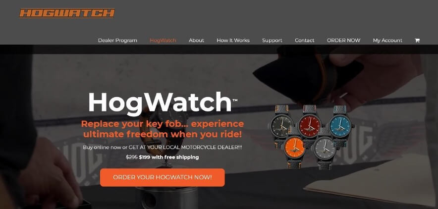
The watches are prominent throughout the home page. Still, the background images and graphics are heavy on the motorcycle theme, marrying the product’s functionality with the lure of the open road.
Plus, even though the watches are never presented as a luxury or heirloom product (as so many higher-quality timepieces are), the website communicates the idea that they’ll definitely stand the test of time.
2. Offerman Wood Shop
Some people know Nick Offerman for his acting roles, while others know him for his furniture. If you haven’t gotten acquainted with his woodworking skills yet, his website is right there for you to peruse – and what a joy it is to explore.
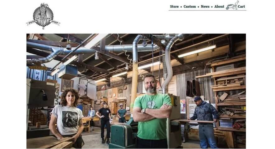
His furniture is solid, straightforward, and bold, and that’s reflected in the extra-large grid layout and simplistic design.
Unlike many furniture sites, you don’t have to use your imagination to picture what the products would look like because they’re depicted in real-looking homes.
3. Lost Dog Café
Recent web design trends are all about minimalism, but the Lost Dog Café has little to do with a pared-down approach.
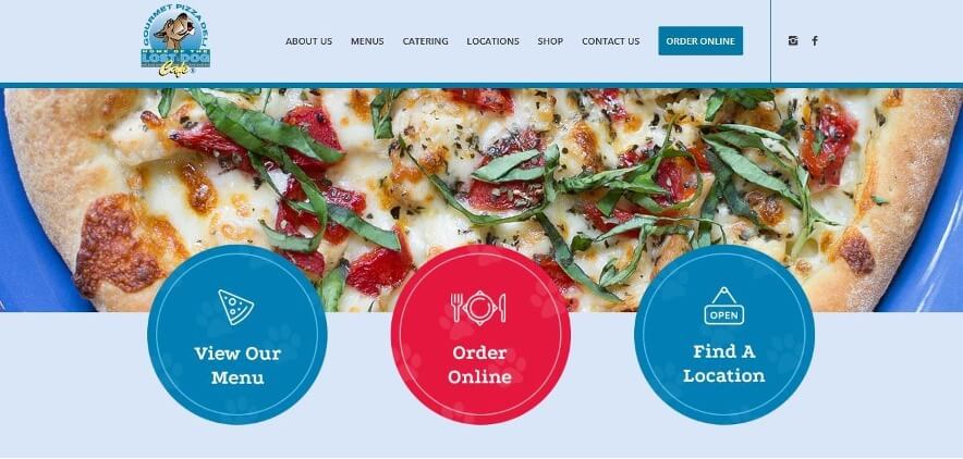
With exuberant colors and some pretty mouthwatering food photography, this website isn’t shy at all. It’s also effortless to navigate – you can easily find where to check out the merchandise, place an order online, or even inquire from different locations about the beers they have on tap, all from the same page.
4. Airstream
Outdoor and travel retailers have a particular vibe to them; you’re supposed to feel the call of the great outdoors, even if you’re just checking out a basic flashlight.
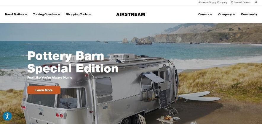
Airstream trailers and coaches, however, are a lot more special than a flashlight, and their website reflects that. There’s plenty of relevant information on each page, but what grabs your attention is the product photography. Glistening trailers sit next to epic ocean views, and every picture is crafted to make you think, “that could be me.”
5. House of Whisky Scotland
Minimalism can take many different forms; House of Whisky Scotland appears as a well-loved wooden background.
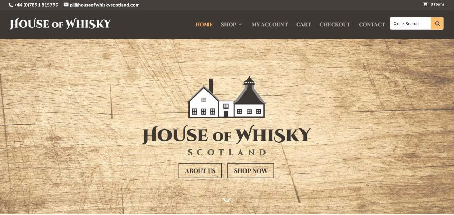
While not all of the website is strictly minimalist, the simple look of the landing page immediately creates a sense of authenticity and trust. One-click will take visitors to the online shop, where they have the option to filter by year – a handy tool for birthday, anniversary, or holiday gifts.
6. Shop Catalog
A sort of companion website to the Thought Catalog (a youth culture site), Shop Catalog occasionally combines heavy topics with a youthful, optimistic vibe.
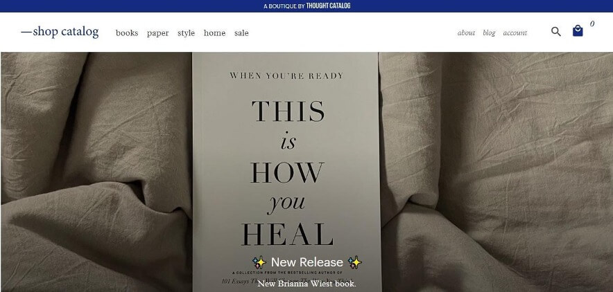
From self-discovery books to highly ironic T-shirts, this website cleverly blends a wide range of items in their store for a self-aware, fun-loving feel. You’ll even see emojis here and there, which contrast nicely with the neutral-tone background and clean layout.
Even though there’s a good amount of information on the home page, you never feel rushed; there’s enough space between each element to maintain a sense of calm while you browse.
7. Flwr
How can you break the mold with an online floral shop? Apparently, Flwr has figured out how.
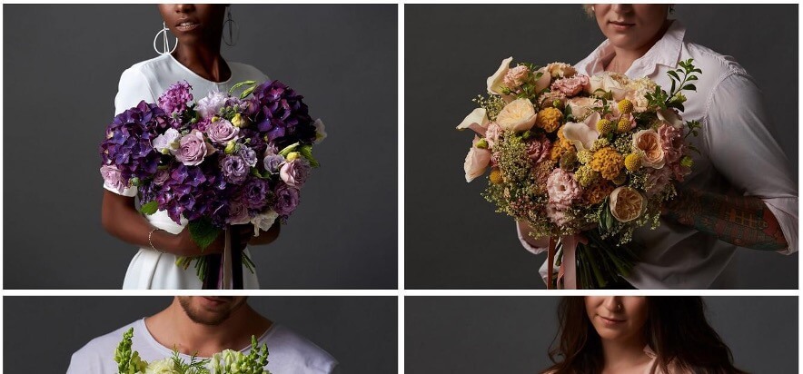
The average flower shop photos would keep the focus on the bouquets by leaving the background pretty much blank, but this site has switched it up by adding models and dark backgrounds—and this has somehow heightened the effect the flowers have for viewers.
Not only do the bouquets feel more personal because models are gracefully holding them, but their full visual impact is evident because they’re placed in what looks like a real-life context.
8. Björk
Björk isn’t really associated with ordinary things, so it’s no surprise that her web store is both a delight and (almost) a shock to the senses.
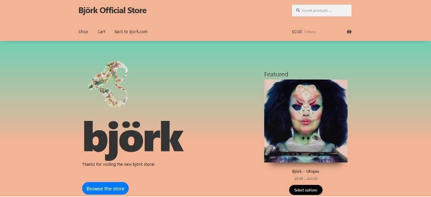
Gradient effects have been used on websites of all kinds for years, but in this case, the colors make it look truly striking.
Her latest album is the one featured item on the home page, which is brilliant because that’s probably why many site visitors are there anyway.
If they want to explore the rest of her products, it’ll take just one click and then some scrolling; everything’s displayed on the same page.
Takeaway
Whether you’re just a casual observer or you have a background in web development, there’s something to learn from each of these sites: there’s no one perfect approach for building an eCommerce site.
You want it to function, sure, but more importantly, it needs to express the brand message.